Znak. Ukrainian Trademarks 1960—1980 is a research by U, N, A collective (Uliana Bychenkova, Nika Kudinova, Aliona Solomadina) on the history of Ukrainian graphic design, in particular, on the area of corporate identity during the period of Thaw, Stagnation, and Perestroyka.
We published one of the texts Studying the World Experience: Westernization of Soviet Logos (1960–1980) by Rokas Sutkaitis from the book.
Globally, the inception of a modern logo is already noticeable in the 1st-2nd decades of the 20th century, especially in the creations of German designer Wilhelm Deffke. Often considered as the „pioneer of a modern logo“ Deffke can be acknowledged with the creation of a reductive logo – a specially designed corporate mark stripped from the excessive ornaments and details so prevalent during the previous era.
The spread of a modern logo was in part determined by the visual culture of the era which was defined by newly emerged avant-garde art and design movements such as Bauhaus. The idea of a „brave new world“ was quickly reflected in graphic design along with corporate marks which took part in the modernist aesthetics established within the art world.
The Soviet Union, even if isolated from the rest of the world, also participated in the creation of the new visual culture. The Bolsheviks created not only an entirely new regime but essentially transformed visual culture. Along with the transformation of arts, the view on applied arts altered as well: graphic design became a special medium that transmitted the Soviet country’s progress. Posters, books, newspapers together with the inception of modern logos reflected the age of technological progress and machine development.
However, further development of the modern logo in the USSR was halted for almost 30 years. The 1940s and early 1950s which were often defined as „the golden age of corporate logo design“ in the Western world did not happen in the USSR. The rapid development of arts and design was quickly halted as Josef Stalin took power. Arts turned back to retrospectivism-infused social realism while the country completely isolated itself from the outside world. Industrial and graphic design was almost neglected, as it could not develop in such an economic and social environment.
The concept of the modern logo finally came to the Soviet Union after the death of Stalin, along with the Warming era initiated by Nikita Churschev. Together with Khruschev‘s inner political reforms outer economic and cultural connections livened up as well. The increased Soviet production export to the Western world accelerated the development of graphic design and encouraged the boom of logo design in the Soviet Union.
The application, registration, and protection of logos were taken care of at the highest levels of USSR government [1]. Keeping in mind that hundreds of post-war organizations did not possess registered logos, the unprepared USSR graphics industry was flooded with new trademark orders.
However, because of the nondevelopment of commerce-related graphic design during the 1940s and early 1950s little was known on how to design modern logos. In order to catch up with the capitalist world, a special exhibition of trademarks was set up in Moscow: „the work was launched on a broad scale and with thoroughness: it started with scrupulously studying the world experience in the field, with a special retrospective exhibition of trademarks in Moscow and a scientific conference devoted to the subject, serving as the cornerstone.“ [2].

Even though during the beginning of the 60s, there is still a feeling of an illustrative quality left by socialist realism, already, after a few years, the characteristics of the soviet marks almost do not differ from the tendencies seen in capitalist countries. Laconic, abstract shapes begin to rule, clear lines and a dynamic of black and white shapes dominate.
While analyzing the Soviet logos from today's perspective, it is practically impossible to say whether a logo belongs to the communist or the capitalist system by simply evaluating its visual appearance. One would expect for a Soviet logo to feature some sort of socialist iconography – a star, a hammer and a sickle or Lenin‘s profile, but the truth is that only a very small amount of Soviet Logos had any socialist iconography inclusions.
If we take a closer look at the logos designed in the USSR and capitalistic countries such as Japan or the USA, we will notice that all of them were constructed within the same modernist spirit. Even if these logos served very different systems their visual appearance is practically identical, suggesting that the Soviet designers had always aimed to become part of the global design context.
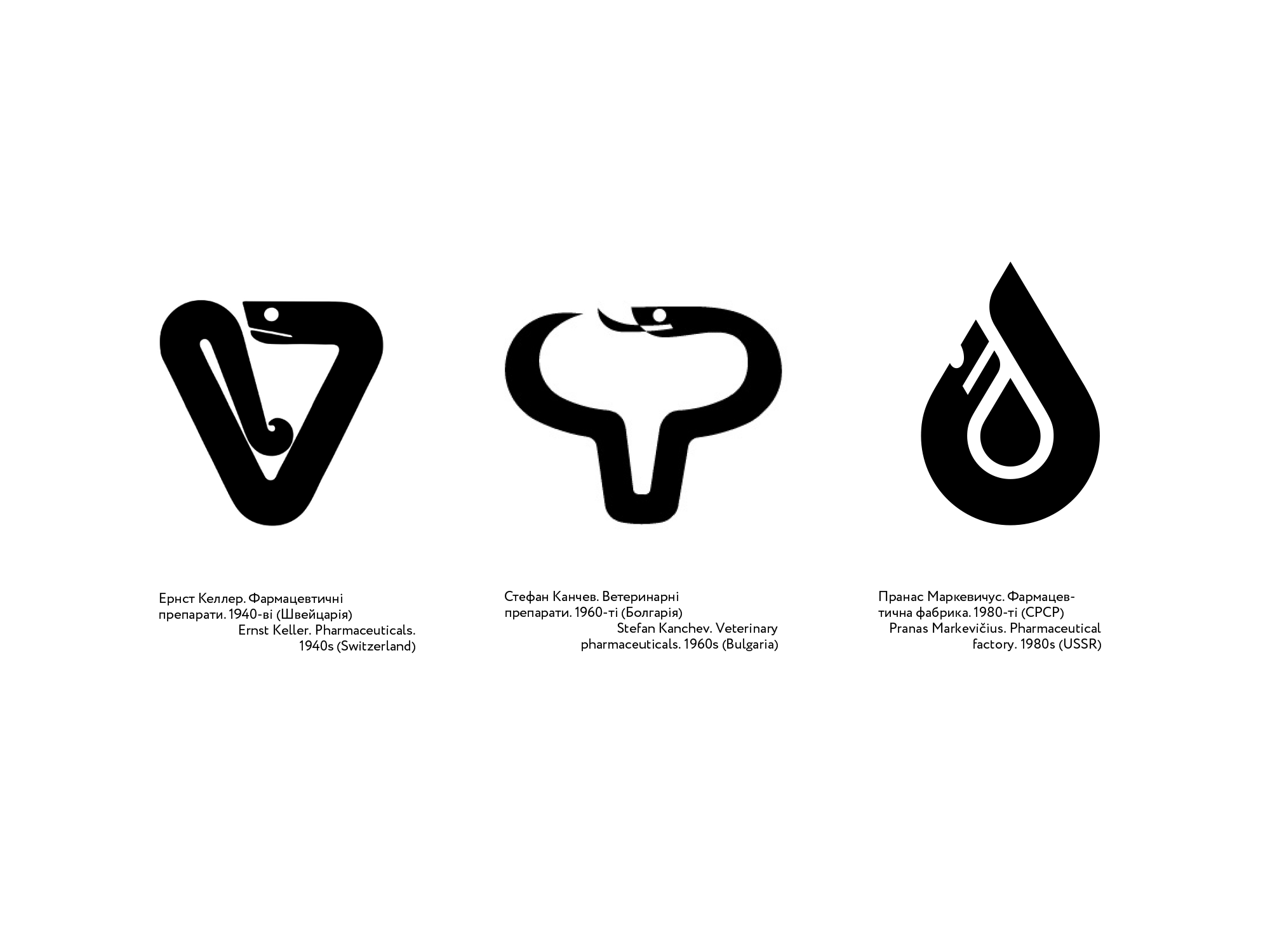
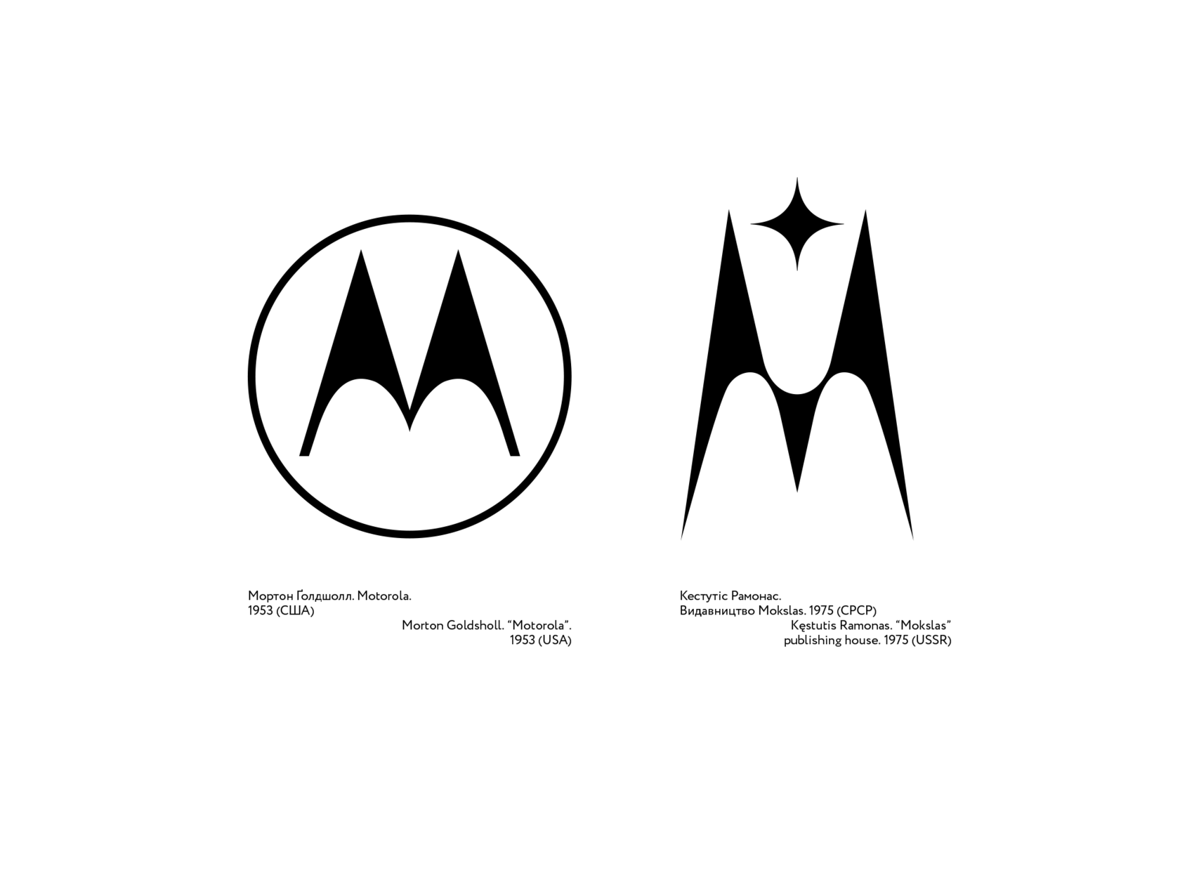
Majority of Soviet logos, even if created more than 50 or 40 years ago, still perfectly fits within the idea of a „contemporary“ logo. Their laconic visual language managed to stay fresh over the years as it was built not on some exotic spirit of socialism, but rather followed the global graphic design tendencies.
Some marks, which were created as a part of the Soviet system to serve its interests, after the change of the economic, social and cultural environment, took on the roles delegated by the new era. Contrary to many other relics of the Soviet era, which in their form and content still transmit the Soviet ideology, logos have become an exception due to their universal graphic expression.
1 Council of Ministers of the USSR, Постановление Совмина СССР от 15 мая 1962 года No. 442 <<О товарных знаках>> (Moscow, 1962)
2 Volya Nikolaevich Lyakhov, Советский рекламный плакат и рекламная графика 1933-1973 (Советский художник 1977), 29